Senior UX Designer, Design Systems
ADP
Foundations used across multiple enterprise products
Breakpoints, spacing, layout behavior, and system clarity
I unified three conflicting breakpoint models into a single system of numeric rules for responsiveness and spacing, reducing ambiguity across design and engineering for ADP’s enterprise platform.
As Waypoint matured and adoption increased across ADP products, the most persistent issues were no longer visual inconsistencies at the component level, but structural ambiguity at the layout and responsiveness layer.
Breakpoints, spacing, max-width behavior, and density rules existed across multiple surfaces—Figma design files, Canvas layout documentation, and utility-class implementation—but they did not form a single, shared system. Designers and engineers frequently worked from different mental models, which resulted in inconsistent behavior at intermediate screen sizes, repeated clarification during handoff, and teams inventing their own layout rules.
This project focused on defining explicit, numeric, system-level rules for how layout scales across screen sizes, while remaining backwards-compatible with existing products and flexible enough to support varied use cases.

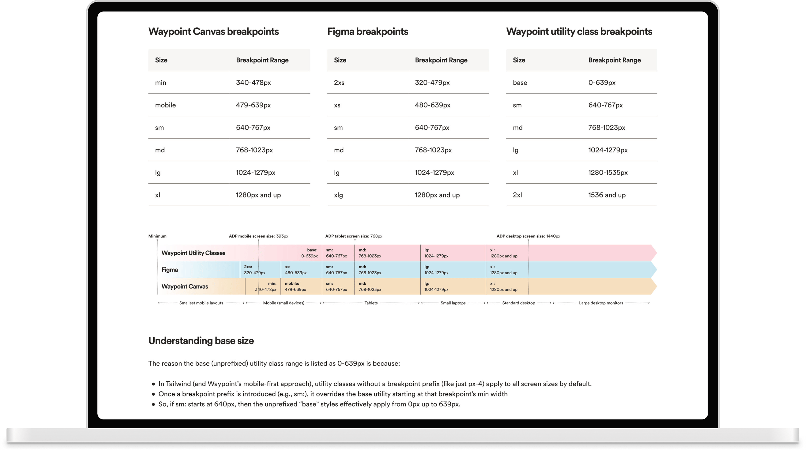
Three separate breakpoint representations existed:
Followed a mobile-first breakpoint model
Used fixed reference widths (e.g. 375px, 1440px) for layout consistency
Defined responsive breakpoint ranges
Designers frequently assumed Figma reference sizes were equivalent to responsive breakpoints. Engineers understood breakpoints as range-based and mobile-first, but there was no shared documentation explaining how these concepts related to each other.
This mismatch surfaced repeatedly during reviews and implementation—especially at intermediate widths (640–1023px), where expected behavior was unclear.
Existing guidance referenced high-level principles (e.g. 8pt grid) but did not define:
Teams inferred rules independently, leading to divergence across products.
Without layout-level rules:
This reduced component reusability and increased design debt.
The first step was clarifying concepts that had been conflated.
Unprefixed utility classes apply from 0–639px. Prefixed utilities override upward from their minimum breakpoint. This single explanation resolved a major source of recurring confusion between design and engineering.
Design reference widths (Figma) are anchors used for visual layouts, not responsive breakpoints that drive reflow logic.
These responsive breakpoint ranges determine layout behavior changes (reflow thresholds) in production.

Rather than attempting to make Figma, Canvas, and utility classes identical, I:
This eliminated incorrect assumptions while preserving flexibility.

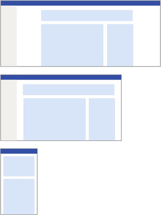
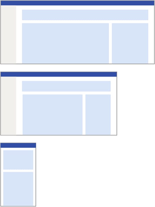
Explicit margin and gutter rules replaced implicit assumptions.
Margins scale intentionally instead of remaining static across all sizes.
Gutters expand only when column counts increase, preventing unnecessary density loss at smaller widths.
Vertical spacing between major layout regions was standardized. This replaced ad-hoc spacing decisions with predictable rules.
To resolve ambiguity around content width, explicit thresholds were defined. This gave teams a shared answer to “how wide should this be?” without blocking valid exceptions.
To reduce misuse of components for layout control, improve consistency and component reuse, guidance clarified that:
Rather than enforcing strict compliance, recommendations were framed as adoptable defaults that teams could implement incrementally.
Most importantly, layout density became a system-level concern rather than a product-by-product decision.
At enterprise scale, layout decisions compound over time. This work reduced long-term design debt by replacing implicit assumptions with explicit, numeric rules for how size and density behave across screen widths—while preserving flexibility and respecting existing products.
This project was not about visual polish. It was about removing ambiguity at the foundation layer so teams could move faster with fewer layout regressions over time. This case study reflects the kind of systems work that is often invisible when done well, but critical to sustaining consistency, accessibility, and velocity across large organizations.


